Rethinking eTextbooks
A research based design project for VitalSource Technologies

My role and process
My Responsibilities:
-
Project manager of research phase
(Survey, interviews, data analysis)
-
Created the Customer Journey Map
-
Paper prototype and tests
Team project
Tools: Optimal Sort, Sketch, inVision
Duration: 10 days
-
Built three sections of the User Flow
-
Usability tested
-
Managed all Sketch files
Empathize
Define
Ideate
Prototype
Test
About the company
VitalSource reading platforms provide students and educators access to immersive, engaging digital content. The company’s e-textbook application, Bookshelf, has more than 5.7 million users worldwide. It's simple for students and faculty to access and use, yet contains robust tools that keep students focused such as search, read aloud, and notes and highlights.
Despite the large number of users and accessibility of textbooks for students around the world, the product team at VitalSource wanted to learn more about the study habits of students to better inform new features of the app.


Specifically, VitalSource wanted to understand how science students might study differently from others in order to design a way to help them maximize their study sessions. The focus of this project was on the Bookshelf web application because that is how the majority of users choose to read.
Business Problem
Bookshelf needs a way to keep users in the app because they want to engage students during their study sessions and increase metrics for highlighting and note taking.
User Problem
Science students need a way to take personalized notes in one place and to comment about the text because they want to organize information while maximizing productivity during study sessions.
1. Research that builds empathy for the user.


Interviews
Our discussion guide for interviews dug into the why and how. Why do people use a certain note taking tool? How do users study from their notes? Why do people enjoy e-textbooks? And, most importantly, how do you feel after study sessions with an e-textbook application? Our key insights were:
-
Students take their own notes and have a very personal way of formatting them
-
Users do not share their notes documents, but share their ideas from the assignment
-
Users prefer GoogleDocs for organizing and sharing with classmates if they choose
-
Users highlight and copy and paste text into their notes
-
One main reason for choosing an e-text is the keyword search function


“Each lecture and reading is a different topic. For each topic I bold headings for sections and underline things. I also bold vocab words.” — interview response
“I wish the notes that you made were all on one page and that there was a tab of all your notes that you made in once place. — interview response from a Bookshelf user
Survey
We started with a survey to gather quantitative information about the methods people use for studying with e-textbooks. We targeted students in the hard sciences nationwide. From those results, we chose eight users to interview.
Survey Quotes:
“I don't share notes. My friends don't do that too. We only share sometimes before the exam.”
“We each take notes by ourselves and then compare them.”
“I don’t usually share notes. We discuss it out loud and make new notes when something comes up that is new”
Contextual Analysis
During 1:1 interviews, we also asked a few participants to complete a contextual analysis. This allowed us to see any pain points users were having in the exact moment they were having them. We created a user scenario for the current state of the app. Our key insights were:
-
The Notebook icon is not recognizable
-
When using the search feature users wanted to keep the Notebook open at the same time
-
To highlight, some users looked for a highlighter tool
-
Users did not know how to add notes. When they realized notes have to be added to highlighted text they said they would prefer to make their own notes and be able to format them.
Users said the Notebook icon looked like a toolbox.

Highlights and notes appear in the order they were made. Notes can not be formatted.
The button to Add a Note was too small for users to recognize.
Competitive Analysis
We compared Bookshelf to other e-textbook and e-reader applications. In doing so, we analyzed the navigation, highlighting features, note taking feature, bookmarking, keyword search, and quizzes or study features. Our key insights were:
-
No other major e-textbook app has a word processing feature built into it
-
Other e-reader apps have main navigation features such as page number and search on the top
-
The keyword search feature is located in the top right navigation bar
2. Defining user needs by synthesizing data.
Affinity Mapping
We used Miro to affinity map our data. After a 30 minute silent mapping session, we came together as a team to discuss the groupings and come to a consensus.
.jpg)

Key take aways:
1. I take notes and format them
2. I break up my study sessions
3. I do not share my notes but I share my comments
4. Visuals help me learn
5. I use online tools to get my assignments done
Personas
The main difference between our personas are the users' organization habits. Both use eTextbooks, but the Distractable Studier does not already have a note taking system they abide by.
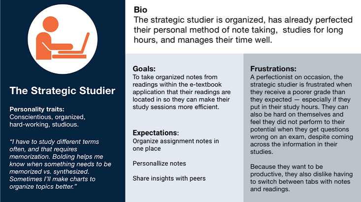


After discussing our research findings with VitalSource, we decided to focus our design efforts on creating a notebook with in Bookshelf to allow users to take personalized notes for their assignments.
3. Ideating with the users' needs in mind.
Design Studio
To kick off ideation, our team used a Design Studio workshop. Each team member took 5 minutes to come up with 6 sketches. Then, each member was given three minutes to present their ideas while teammates took two minutes to give feedback. Finally, all team members took another five minutes to steal ideas from a team member and create updated versions of those designs.
After the workshop we spent 30 minutes discussing and collaborating on the best solution and delegated responsibilities for bringing it to fruition. As a result of this workshop our team was able to align on what the initial sketches for the new notebook feature would look like, how the user would interact differently with Bookshelf as they used the notebook, and the user flow we were going to test.
.jpg)
%20copy.jpg)
Customer Journey Map
To align the team on the impact that the new features of Bookshelf will have on our users, I created a customer journey map. In this map, stakeholders have a clear idea of the pain points users are having within the current app and the opportunities to make the user experience better by implementing note taking and commenting features. The map also includes a scenario and the expectations of our user.
Paper Prototype
Creating a paper prototype was a time-saving and cost effective way to test how users would expect to take notes and add comments to a text. We asked users to place icons in the locations they would expect to find them, and the ways in which they would want to organize their notes or interact with the text.
We discovered:
There should be a “comment” button in the location where comments will appear.
Users want to expand the size of the notebook to make it wider.
Users did not prefer clicking a highlighting tool and then highlighting text.
Solution
We believe that by creating a robust note taking and commenting tool within Bookshelf, science students will be able to organize and personalize their notes in one place and share their insights with their peers before study sessions.
We will know this to be true when use of the note taking tool has increased by 10% within 4 months.
User Flow

4. Prototype, test, iterate, repeat.
We made the following iterations as a result of feedback during usability testing.
1. Opening notebook

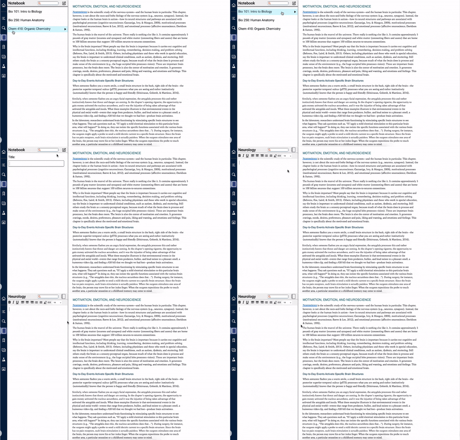
Initially we created the notebook to open to a blank note taking screen. After usability testing, we discovered that students typically do not start a blank note taking document unless it is the start of their course or a unit. They may organize their notes based on topics and have multiple readings within that topic. Therefore, users need to access the same document for different texts. We changed the flow of opening the notebook to start with users selecting a previous document or creating a new one.
Mid-fidelity prototype

Includes audio description.

View with subtitles

Next Steps and What I Learned
Feedback from VitalSource:
1. Agreed that the current notebook icon should be changed because it is misleading for students.
2. The robust features that differentiated our new notebook from other word processors were a great way to keep students in the app.
3. VitalSource said that when hyperlinking notebook text to the textbook it would be hard to change the color of the textbook text.
4. During the research phase gather a larger number of survey respondents for a stronger data set.

I learned that feedback from the client throughout the process is key to success. By integrating meetings with VitalSource into our project plan we were able to focus on the design of the Notebook feature instead of other design ideas that came about during our design studio workshop such as moving the search bar or adding a quizzing feature.